I designed an internal tool for the retail sales team that streamlined complex workflows and increased their task efficiency.
The sales team faced challenges to achieve their sales target as they relied on multiple tools for different tasks, causing delays.
Make the sales cycle faster
Reduce dependencies of sales team
Reduce cognitive load on the user when visualizing complex data
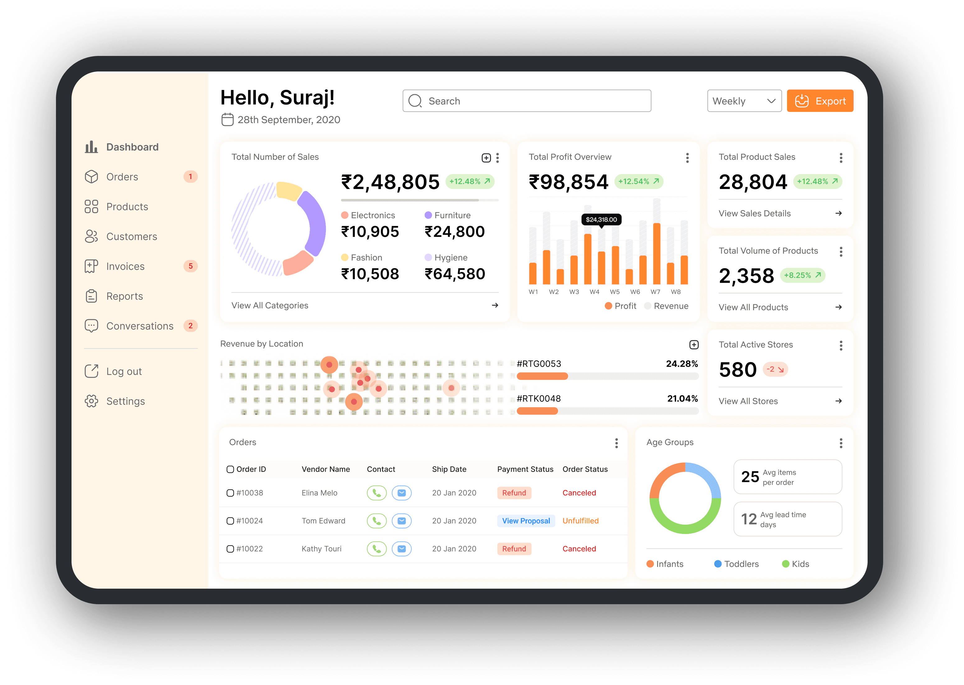
Contributed to design an enterprise dashboard for sales team
Collaborated with 9 designers to maintain consistency across the platform at scale
Product Design Lead (me)
Product Manager
Front-end and back-end Engineers
Sales team(users)
$340M
Revenue (increased by 20%)
30%
Faster sales cycle
23% to 56%
Business deal conversion
35% to 55%
Post launch user engagement
The metrics was gained using Google Analytics in the tenure of 6 months from our internal tool and a B2B marketplace.
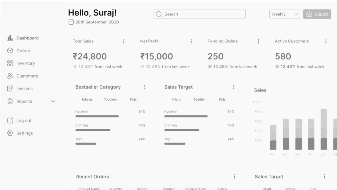
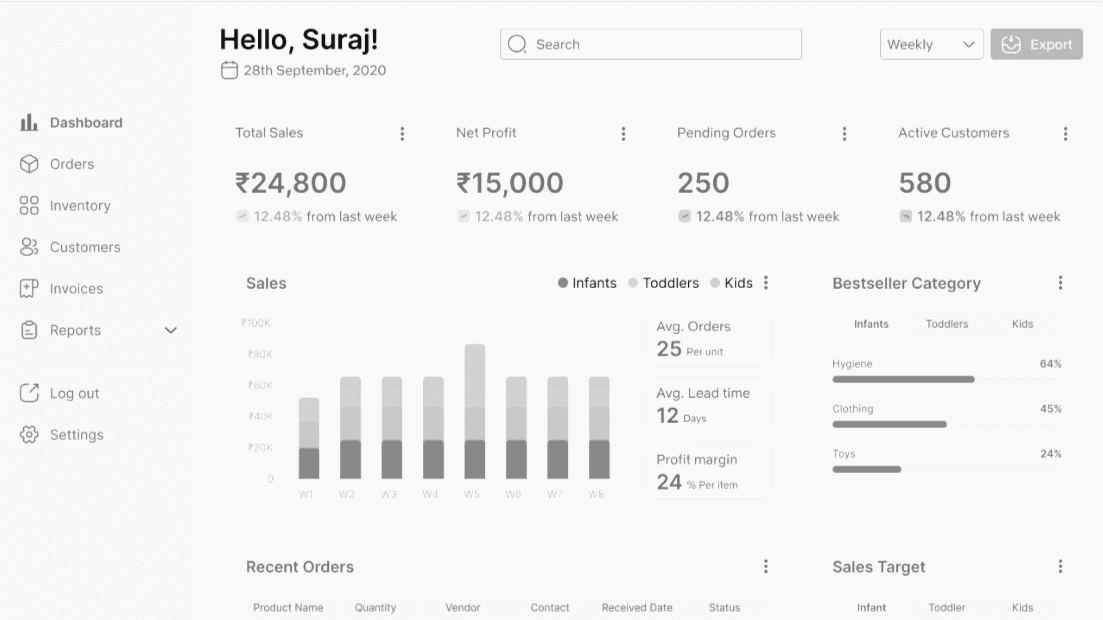
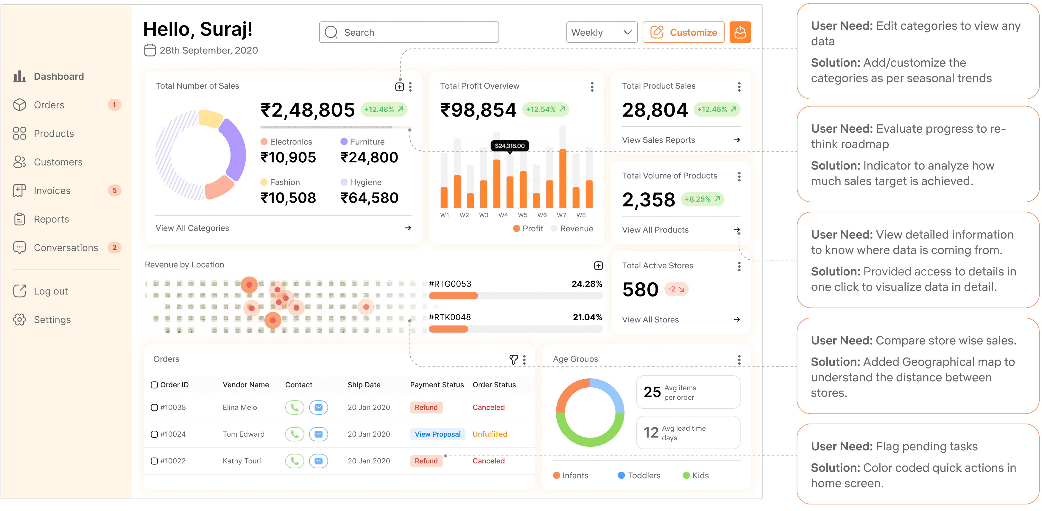
Data visualization dashboard for retail sales
I demonstrated my design impact through proposing multiple stats, visual heirarchy, and navigation flows that reduced cognitive load on user.

Shared pages to reduce dependancies
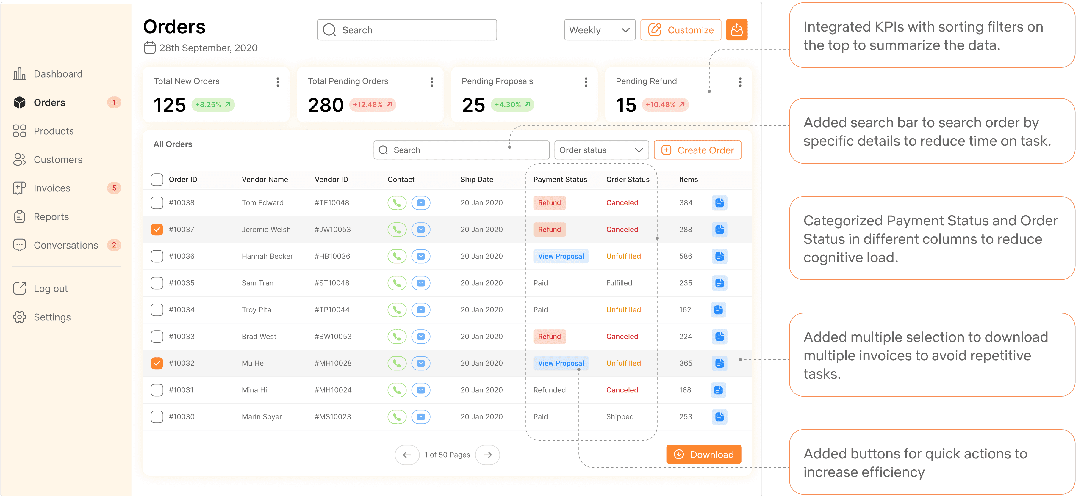
I designed shared order page for sales and inventory. I color coded call to action buttons and added indicators on the top to prioritize the tasks.
Manage conversations using AI chat assistant
I designed UX patterns for an AI powered chat assistant to reply to retail partner's order related queries. This saved repetitive tasks for Retail Sales Team.

Customize sales data in less than 3 steps
I created interactive prototypes in LOVABLE.DEV to present how I will leverage generative AI tools today to deliver mockups and developer handoff.

FirstCry.com is a platform combines e-commerce with omnichannel retail.
I got an opportunity to work with the Retail Sales Team to design an internal tool ecosystems.
25M
1073+
98%


User Interviews
User Flows
Design workshops
Wireframes
Usability testing
Developer Handoff
Time ticking
The sales team was losing sales, which directly impacted the revenue models of the company.
Overcoming the challenge
Defined a design strategy to prioritize tasks for north star vision.
Aligned design vision with stakeholders to win as a team.
Navigating ambiguity
Overcoming the challenge
Collaborated with cross-teams to understand their motivations.
Identified the root cause to frame the problem statement.
21
Hrs
~Weekly time spent
Analyzing sales data
Identifying potential business opportunities to pitch new products.
Make marketing decisions for products in inventory.
23%
Conversion
Customer relationship management
Provide personalized services to maintain over 98% retention.
Negotiating deals with retail partners.

Why did I conduct user interviews?
To empathise with the pain points the sales team faced and what slowed down their workflows to achieve sales targets.
To identify the root cause in the complexity of the existing workflows so that I can provide solution for long term problem solving.
Learnings
I identified their dependencies on other stakeholders and third-party apps.
The online/offline legacy flows are slowing decision making process.


-VP of Sales team at Firstcry.com
Legacy flows that made sales reps slower
User flow of how sales team reached to the retail partners.
Pain points + Identifying root cause
Relying on third party applications
Raised security concerns
Increased dependency on other teams
Limited customization to analyze the data which increased manual errors
Repetitive tasks
Communication gaps with teams
Delays in maintaining relationships with retail partners
Increased lead time to deliver orders
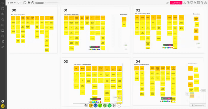
Part 1: Hybrid Card Sorting
Part 2: Internal reviews through ideation workshops
Why card sorting workshops?
To foster cross-functional alignment between design, product, tech, and sales teams.
To unify grouping and navigation through task flows with the users.
Results
I redefined legacy flows by reducing sales team dependencies on other teams.
I got my foundation of the information architecture.

Navigation audits + Feedback loops with internal design team
Challenges faced in information architecture
Sales proposals and order management were previously handled across disconnected tools.
There were inconsistencies in navigation of order page and product page tables.
Overcoming the challenge
I validated the navigation of multiple pages with assigned designers to maintain a cohesive user experience across our platform.


Screenshot of information architecture for filters used in the dashboard
Wireframes + Feedback loops
Why at this stage?
To get buy-in from the cross-functional team and understand diverse perspectives.
To inform the design direction for alignment with the shared goals across the platform.
The results
I standardized UX layout from the constructive feedback gained.
I tackled the edge cases with the team with possible trade-offs.

Wireframes + Feedback loops


Phase 1
We had our own established design system. I started with auditing our design systems to create reusable patterns.
Soon I realized that this existing design system is not compliant with our features. These were our primary blockers:
Inherited Design System
Existing design system originally built for the marketing website and the Firstcry.com mobile application.
Inconsistency
Mobile-first styles caused visual inconsistencies across desktop screens. We couldn't adapt these into our design.
Scalability Issues
Components broke across breakpoints and weren’t optimized for scalability, They were incompatible for our user needs.
Misalignment with Internal Tool Needs
Existing components didn’t support complex B2B enterprise workflows or data-heavy dashboards, bulk actions, tabular views, etc.
Phase 2
Why Atomic Design System?
Designers can focus on solving user problems rather than redesigning basic UI elements.
Easier to document usage, behavior, and accessibility standards of each component.
To create shared design vocabulary with dev for team efficiency.
Ensures design elements like buttons, inputs, cards behave and appear the same across the product.
The process
I worked closely with engineers to define token naming, states, spacing rules, and variant behaviors to ensure consistency, scalability, and speed in development process.
This time we had flexibility to create design system that is suitable for user needs.
We used the existing design systems as our foundation of design guidelines.
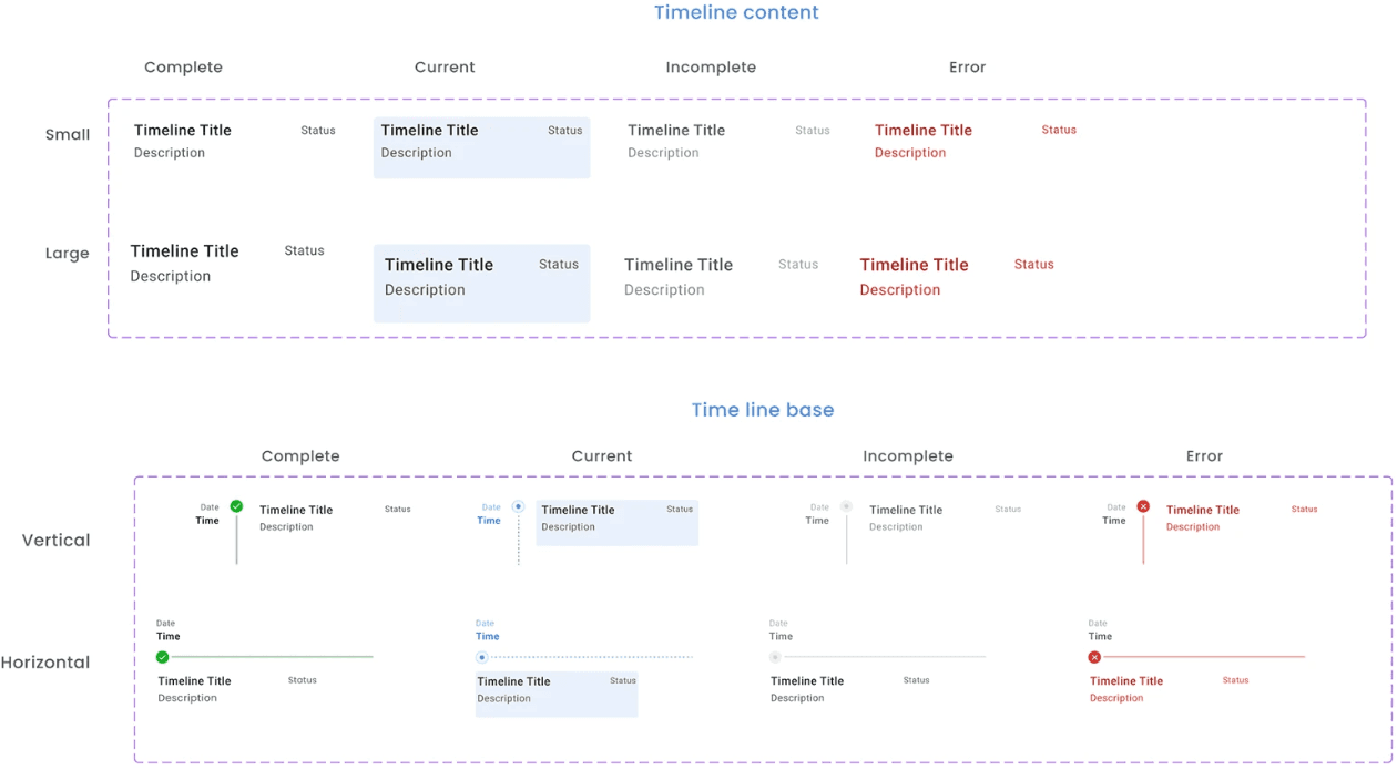

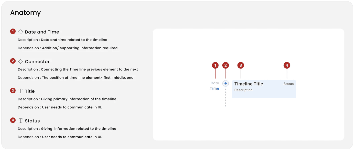
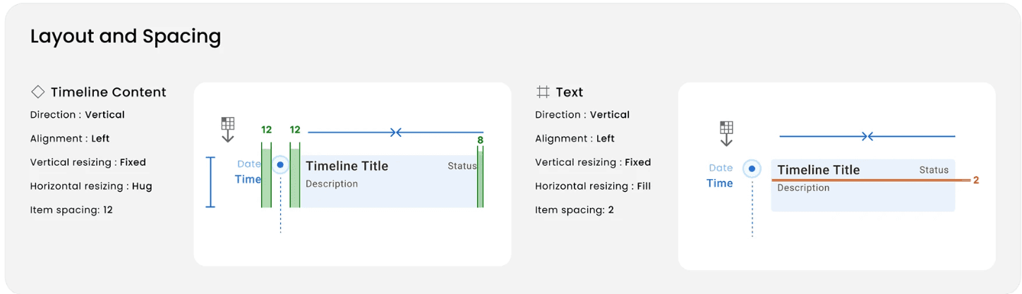
Screenshot of one component; its guidelines and anatomy
New Design system is scalable
Design tokens allowed us to scale quickly with minimum friction in developer handoff.
New features could be designed and developed quickly using existing blocks.
Components are consistent
The same elements appeared the same and behaved the same across the platform that improved usability.
Reduced design QA loops and increased the adoption of design systems.


Mockup for customize categories


Dev Handoff
30%
Increase in task efficiency
User relied on multiple third party apps to visualize different types of statistics. I consolidated those statistics in one page. I provided flexibility to customize dashboard with seasonal changes.
0
Manual calculation errors
Because of limited customization in third-party apps, users had to put together sales reports manually. We automated those workflows for the users to reduce the friction and manual errors.
5
New stores opened in India and UAE within 6 months post launch
Due to faster sales cycles and automated workflows, the sales team could focus marketing decisions.
From this

To this

Before this application
After cracking the deal, retail partners would put order with sales team. Sales team used to pass it to the inventory managers. This increased wait times due to lot of back and forth tasks.
After introducing this internal tool
Retail partners placed order through the application. It directly went to the inventory managers. We created a shared order list so that sales team can monitor the progress.
What changed?
I reduced the steps by creating shared database. This reduced wait times in approvals and manually sharing order status as the data became accessible for sales team.
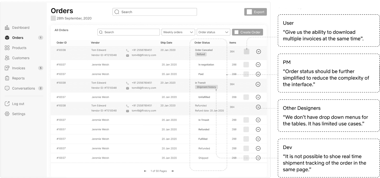

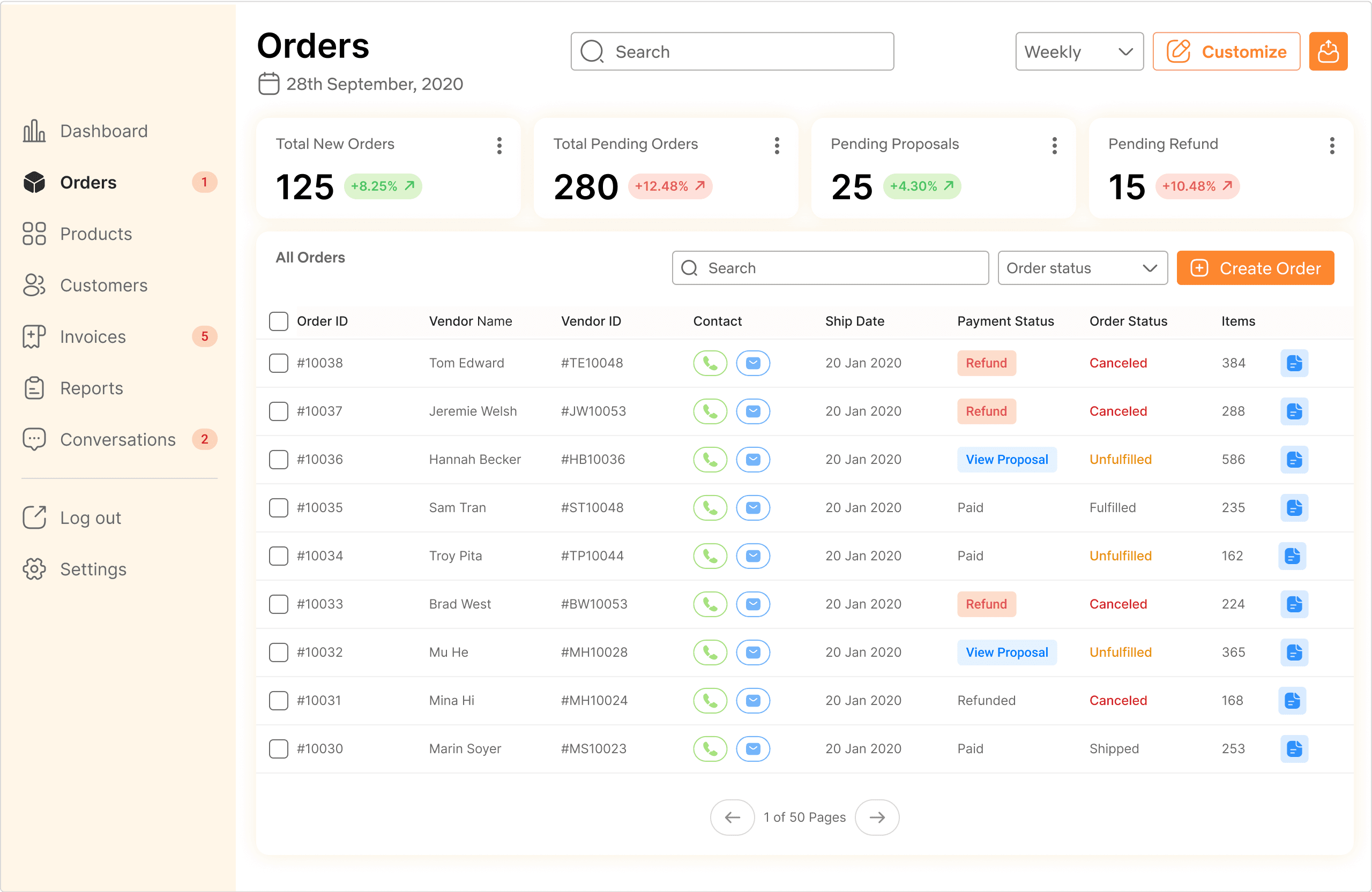
Challenges in order screen
The stakeholders wanted to increase the task efficiency to manage business deals.
The Product Team wanted to achieve the desired KPIs.
Moderated usability testing
Users were using same sorting filters whenever they open this page to complete a task.
We decided to replace sorting filters on the top with KPIs.
Unmoderated usability testing
With collective efforts from Product Managers and the design teams, we evaluated task completion time , number of clicks, and error clicks with our users to understand where we can improve our user interface.
Challenges in refund flow
In refund flow we were not able to achieve the desired KPI to refund order.
PMs gave me feedback to remove manual data entry.
How I overcome the challenge
I conveyed the need of manual data entry through user journey maps.
I added checkmarks in refund section to reduce time on task.
Impact
Got buy in from PMs to keep manual actions.
Demonstrated how design increased efficiency in refund flow.

After validating our new enterprise tool with the stakeholders and executive leadership, a new stakeholder customer support team was added.
Goal was to improve sales team efficiency by automating responses to retail partner queries.
Stakeholder expectations-
Create an AI assistant that will generate automatic responses for retail partner queries related to order status, product quality, and product training.


Challenges faced in initial stages of pivot
How might we integrate it with existing workflows without hindering the KPIs?
Do we introduce new patterns in design systems?
How to show multi-modal of AI assistance without user going back and forth?
Overcoming the challenge
I focused on evaluative research with customer support to adapt quickly.
I studied the competitors like existing desktop version of chatbots for feature prioritization.

Challenges faced in continuous improvement
How might we increase user adoption of AI chat assistant?
Is it possible to reduce the dependency on engineering team to personalize responses?
Does the bot stops responding after a human intervention?
Overcoming the challenge
I only prioritized high-volume, low-risk messages for customer support.
I added a 'Bot Setting' page to automate customer support workflows for the team to edit and test the type of responses as per keywords.
Functionality over pixel-perfection in internal tools.
The constructive feedback from engineers, product managers, and end-users each contributed valuable insights that informed my design decisions.
Build a great product, not an MVP.
how i could do things differently today